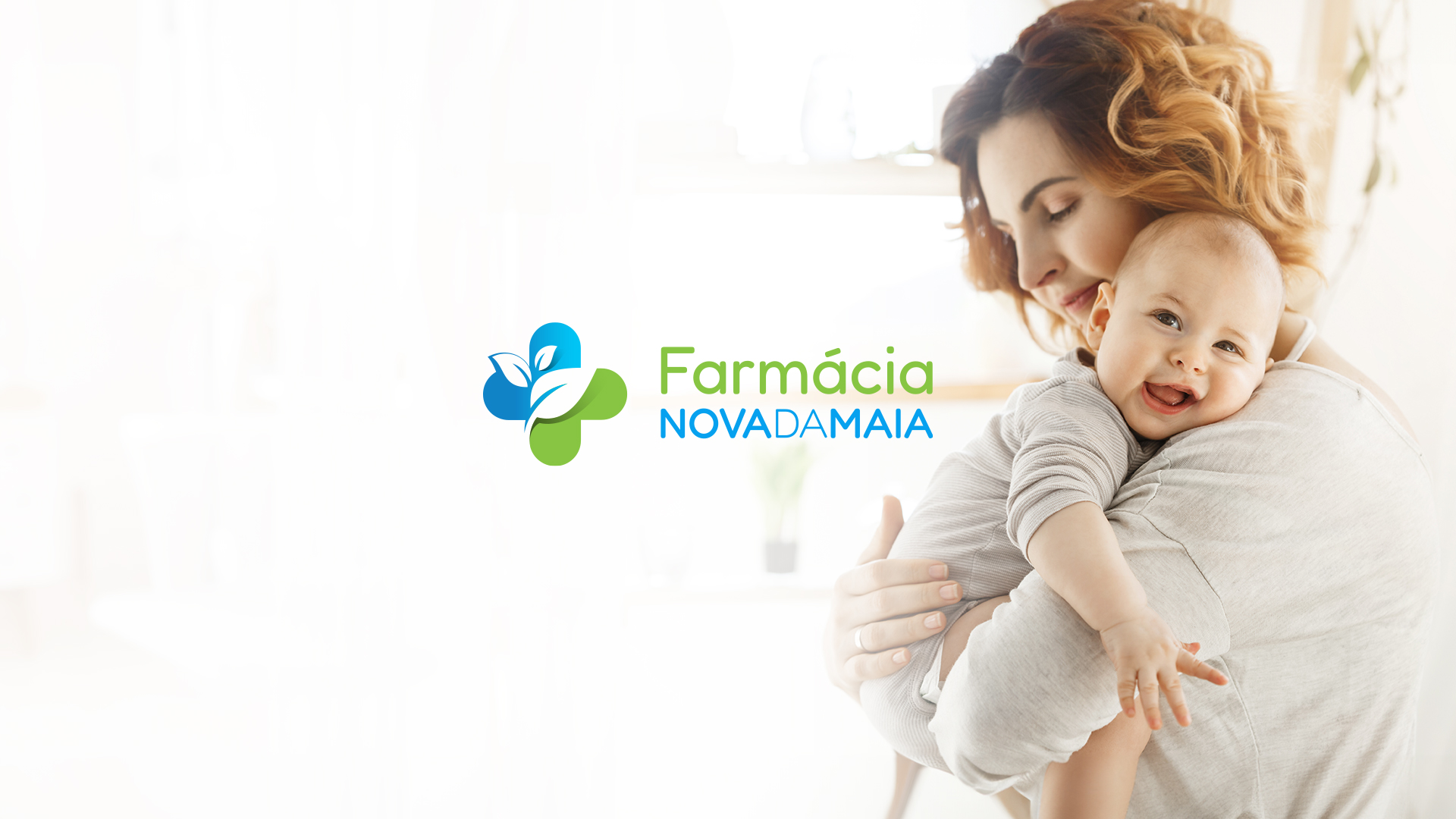
The evolution of Farmácia Nova da Maia brought with it a renewed experience of proximity, comfort, and modernity. The move to a larger, brighter, and more contemporary space highlighted the need to align the visual identity with this new reality. We developed a brand refresh that preserved its essence while redefining its visual presence. The intervention focused on creating a lighter, more human, and welcoming visual language through the refinement of the color palette, the balance of graphic elements, and the alignment of the identity with the real experience of the space.
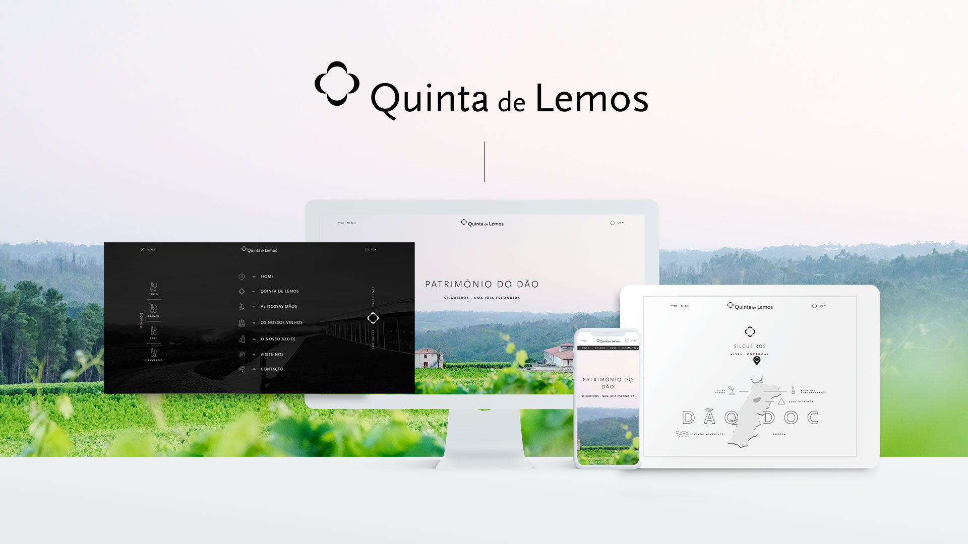
Quinta de Lemos is a project that strives to share with the world the best in the Dão Region. Get to know not only the wines but also the faces behind this family project with proven track record. A layout that values photography and content organization in layers to promote a true sense of discovery of this brand's history. See everything at www.quintadelemos.com.